Showing Colours
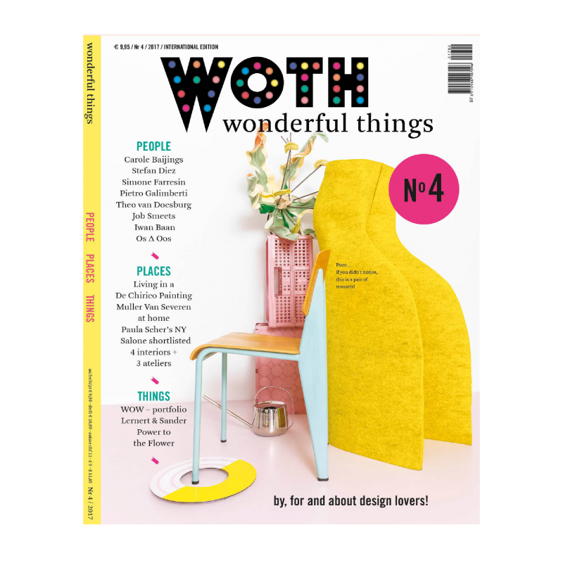
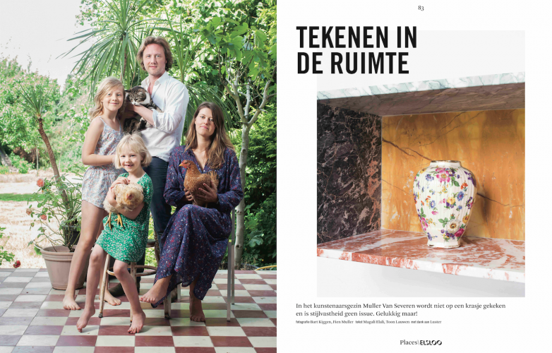
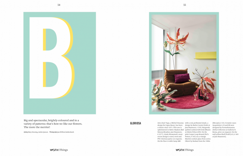
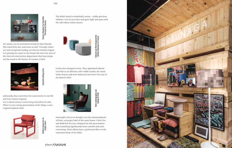
An idiosyncratic use of colour says a lot about a magazine, too. Or that’s what we think. WOTH shows its colours because colours equal character. We love the typical combinations that made Muller and Van Severen world famous: arsenic green, salmon, lemon yellow and cyan. Red in all shades and flavours stands for the Dutch Studio rEns. In Milan, they’re showing their new cabinets: red (with the tiniest bit of white and blue).
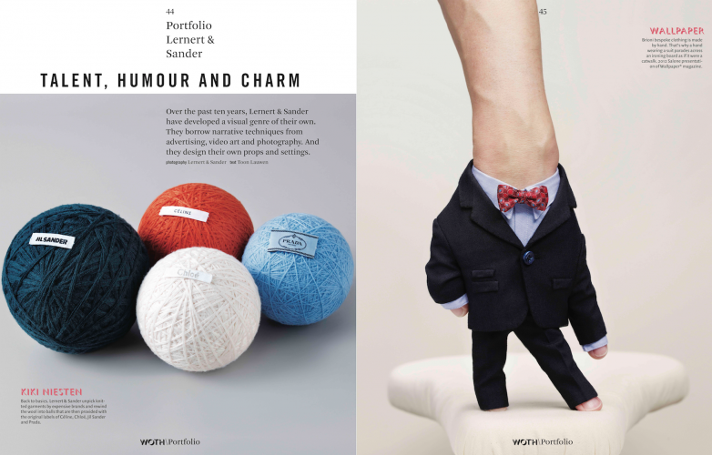
Raw Color: what’s in a name?! Colour is pretty much their reason for existence. We’re currently experiencing a 1980s revival with lots of pastels and vivid primaries. Black-and-white stripes are also back. At the IMM Cologne, we noticed every shade of coral.
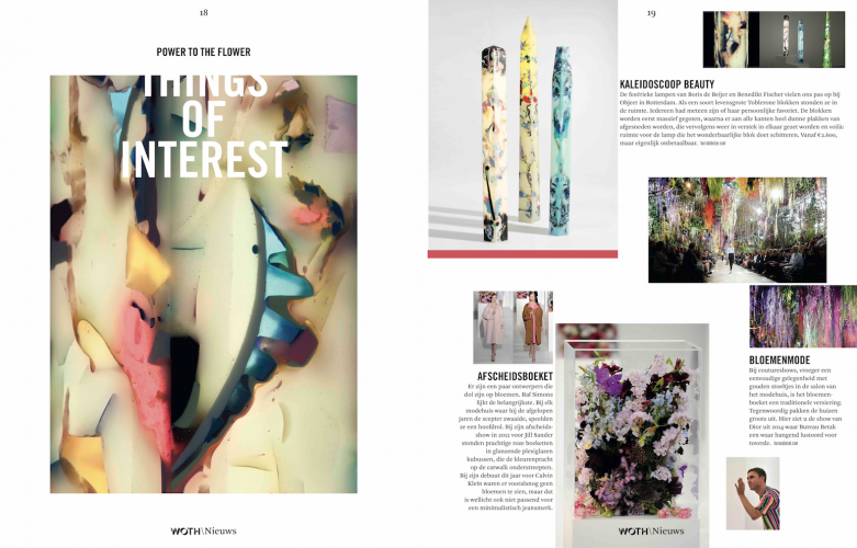
Colour is a sign of the times. We don’t mean the trendy tones with the fun names that the paint industry sells as happiness helpers. We choose colour manufacturers and stylists with the open mind and the gusto for experiments necessary to create optimistic palettes. And we advocate ‘forgotten’, now unpopular hues such as beet red, vanilla, ochre, lilac and cognac. Take, for instance, that dirty egg yellow you’ve loathed for so long, that actively annoyed you! That’s now beginning to grow on you and make you wonder. Have the guts to use colour, you’ll be so much happier. Colour lovers unite! WOTH’s the place for you.
— Foreword founding editor
Mary Hessing

