Bethan Laura Wood

London based designer Bethan Laura Wood a mundane character. Her work and looks are filled with colorful optimism. She seems to exude all colors of the rainbow

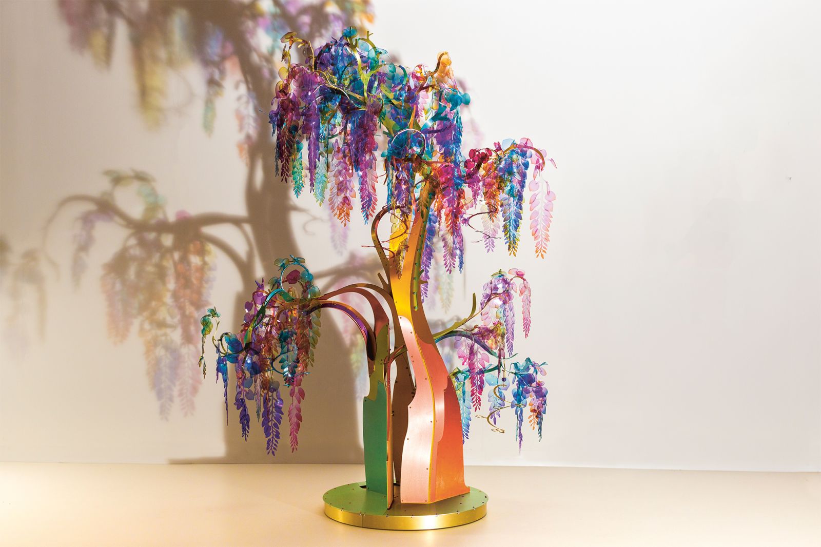
Earlier this year Wood has improved her chandelier made up out of blooming imitation wisteria. ‘During the lockdown, we discovered a quite serious construction error that we would not have seen, if not for the extra down time due to the lockdown. It gave us the opportunity to double check everything, making sure they were all hanging the right way.’ 

There too were other advantages, because of the lockdown. ‘I finally had time to make a series of drawings of a pet cactus I bought in Brazil. I had wanted to do this for ages. I think its shape is amazing. I have seen it grow every day, especially this summer. It was quite interesting to wake up every morning and discover the shape of the cactus changed once again.’ 

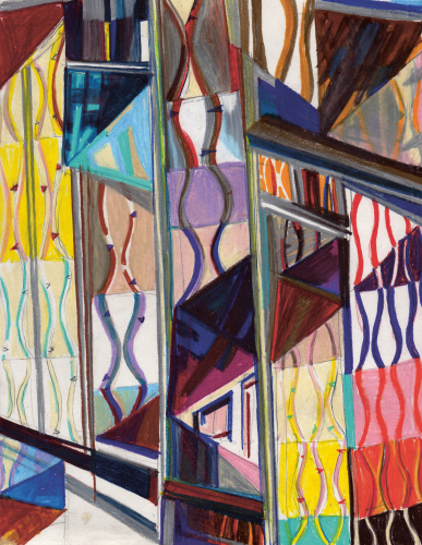
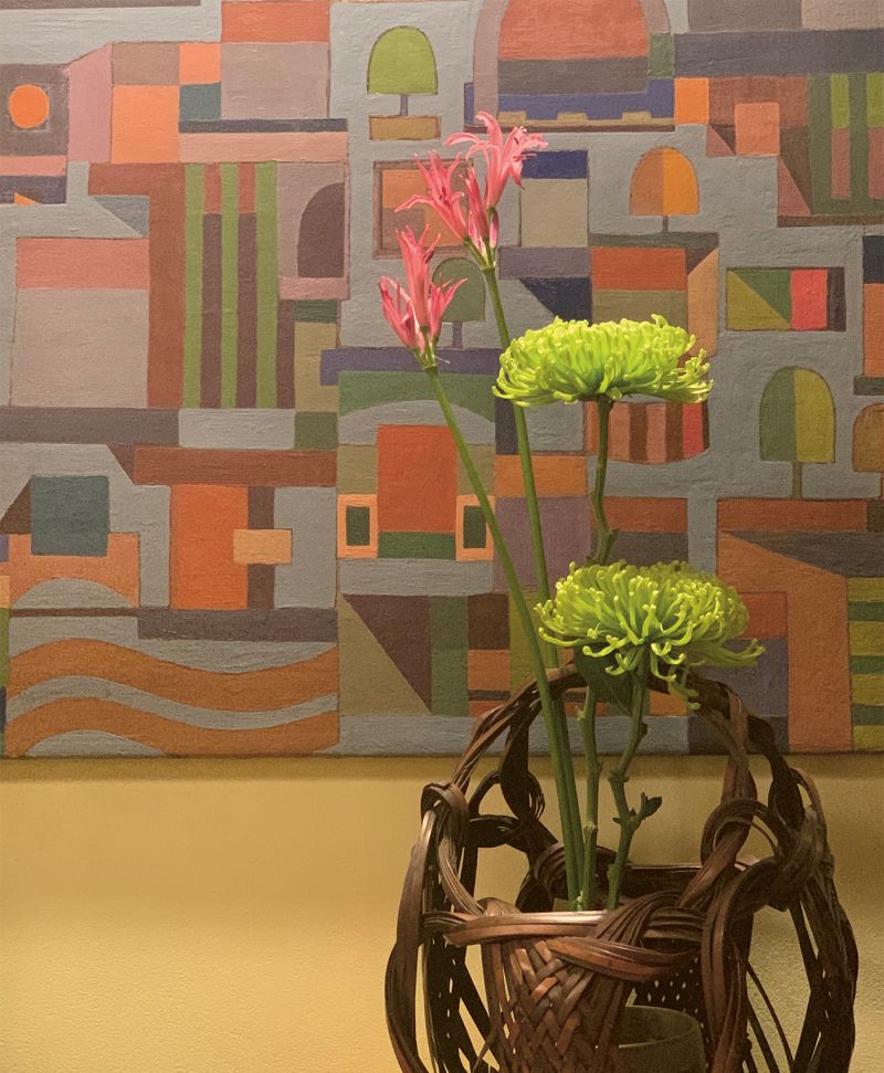
During this peculiar period, when she was not allowed to leave the house, she stared for hours at a French abstract painting she bought before lockdown. ‘You can find it on my Instagram, it has a very interesting color palette of browns, flesh colors, orange and green. I used to only be attracted to vibrant colors and have never been very interested in those muddy greyish colors. She laughs. ‘But when you reach a certain age the brown shades in your life start to take command, your viewpoint obviously changes. So I was increasingly more interested in the mixture of muddy colors and now see new options with these colors. I’m working on my love for brown. So who knows, maybe you are going to see more brown in my work.’

So far the colors she has used were bright and cheerful. Since 2009, in her studio in London’s East End, Wood has developed a colorful and diverse portfolio, consisting of projects for the brands like Rosenthal, Perrier-Jouët and Valextra. Wood grew up in the Midlands but felt drawn to an environment that exudes urban energy. After studying Three-Dimensional Design in Brighton, she left for London.

Artwork 2 Bethan Laura Wood Woth @JW.Kaldenbach
Artwork sketch Bethan Laura Wood Woth @JW.Kaldenbach
Artwork 1 Bethan Laura Westwood Woth @JW.Kaldenbach

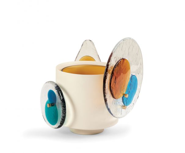
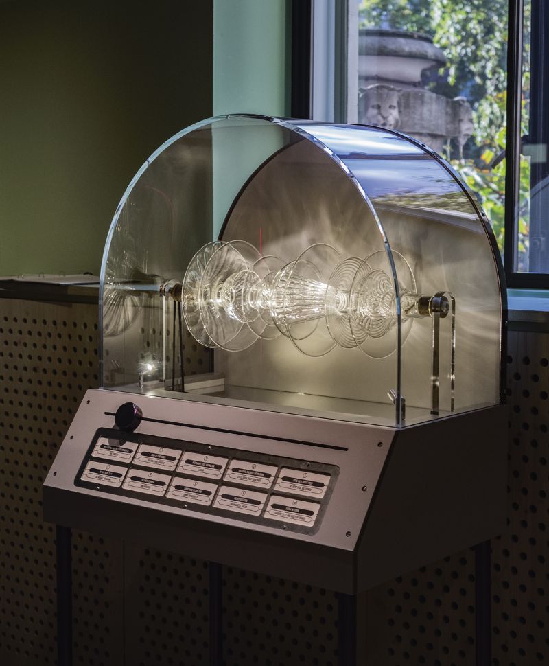
Colourdisc made of Murano glass. The glass forms are fixed to the structure’s body with two brass pins drawing an abstract shape of the traditional 1960s disc
chandeliers. Venini for Cassina, 2020. 


Sketch for the Guadalupe Daybed. Commissioned for the Divina exhibition by Kvadrat, 2014. 


context

To many people colors and patterns are superficial or ornamental, but in Wood’s work they originate out of a sense of depth. ‘Most people think my main focus is always on colors and patterns, but it is actually about layers and composition. I don’t just stick something on a surface. The starting point of all of my projects is its context, history and colors and techniques previously used by a client or brand. Following the research I will blend their identity into my own style, which offers the new project a new personal touch.’ 

Take for instance the tea set for Rosenthal. After doing some research in a house designed by Bauhaus founder Walter Gropius, Bethan Laura discovered that there once was a glass room filled with live flamingos. Peacocks used to roam free on the grounds. So she added peacock blue and flamingo pink to the new Rosenthal tea set. ‘I very much like this bubblegum look, which almost makes the porcelain look soft and kneadable, instead of hard.’


‘I am increasingly more interested in the mixture of muddy colors’


pepper 

Wood never stops studying color combinations. She is always busy finding a special new color combination, that slightly differs from the palette people are used to. ‘Its always very interesting to study which colors people buy and use to create their version of harmony. Take for instance the color of a liquorice. Some people love it and others deeply resent it, because it makes such a strong statement.’ 

She challenges herself to always add a color that doesn’t fit easily into the color palette. ‘On their own these colors often look too strong and overwhelming. But when you add just a touch of them to another palette, things start to change and become interesting. Similar to putting pepper on a strawberry: mixing different worlds’. 

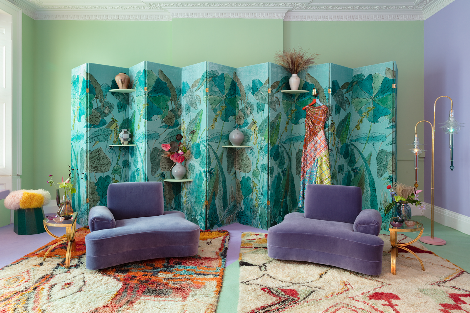
An example of this approach is the intense red she used in her Hot Desk. ‘The color gives it just that extra oomph.’ A color palette that makes Bethan really happy is that of her Guadeloupe daybed. ‘I am really in love with that joyful color combination.’ It was inspired by her trip to Mexico in 2013. ‘The use of color is so much more vibrant and free than the palette in London. Once I had been to Mexico, I could not return to the ‘London palette’.

It is rather difficult to discuss colors with people, she remarks, ‘I always compare it to champagne. To experience the taste, to understand its nuances, you need to move it around your mouth. Taste it on the tip of your tongue. Working with colors to me feels the same as tasting different flavors.’ 
happy outsider

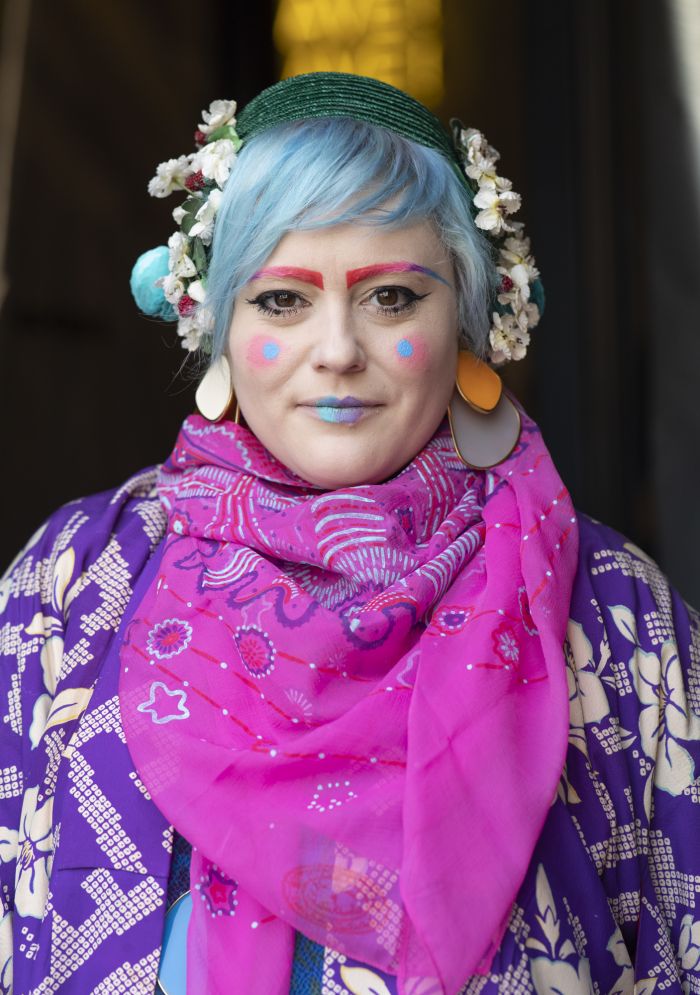
Wood’s appearance immediate draws attention, even in the trendy borough of Shoreditch people in the streets stop to take pictures. Her outfits with patterns in vivid colors, blue hair, large jewels and striking make-up immediately catches the eye as well as the camera. Bethan Laura Wood sometimes is even compared to a clown, which she does not consider an insult, but rather a compliment. ‘Clowns dish out comments nobody dares to utter. But because they don’t pose a threat often open people’s eyes.’ Through her work, ideas and appearance the rol of a happy outsider seems to be stick just perfect to lovely Bethan Laura Wood.;