This interview was published in WOTH issue No9 still available in our shop.
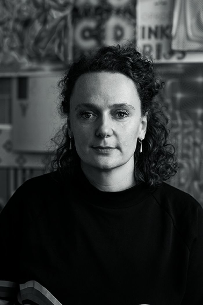
Hansje van Halem
Hansje van Halem’s letters and patterns look hallucinatory, but they’re the result of systematic precepts. The graphic designer researches the limits of technology simply by working with it. ‘Twisty’, Hansje van Halem says the word casually and strangely enough you know exactly what she means. Just like ‘blobbify’ and ‘forging’ sound very natural when she’s talking about her work. ‘When you’re developing new shapes and are discussing them with an animator or assistant, you need to have the words to describe them,’ she explains her neologisms. ‘And at a certain point it’s just what they’re called.’ However natural it may be, twisties are worlds apart from the strict aesthetic views of the Rietveld Academy where she graduated in 2003. ‘That was in the age of little white books. Everything clean and hardcore conceptual. There, I kept pushing the envelope. After the Academy I started work as a book designer. While waiting for input, corrections and agreements, I started drawing letters and they evolved into patterns and later into typographic drawings.’


cobwebs
Van Halem’s style, which we know from music festival Lowlands, the VPRO tv-guide and posters for dozens of artists, can be described as ‘psychedelic complexity’. Her letters emerge from a cobweb of patterns. Your eye is pulled into a rollercoaster ride, comparable to Op Art in the 1960s. The modernist motto of ‘less is more’ is kicked to the curb and traded in for horror vacui (fear of emptiness). Although she certainly tends to beautify, Van Halem firmly rejects the term ‘decorative’. ‘It sounds too noncommittal and my patterns aren’t that at all. They are very systematic, there’s a mathematical precept behind them. My work for Lowlands is a good example. There, the background consists of horizontal lines and the vertical lines form the letters. You can play with the width of the lines and the space between them. In the animations this is done using an algorithm – my first industrially produced pattern.’
crisis
Van Halem is by now one of the most famous typographers in our country. But to get this far, it took two crises: one personal and one economic. They happened around 2009, after working in her studio for six years. ‘I had a studio in Amsterdam Noord. It was cold and street youths were bothering me. I couldn’t stand it anymore,’ she says. ‘So I decided to work from home. I crammed 50 m2 of studio into a 60 m2 house. I decided to finish the ongoing commission and then do something else entirely. At home, with a small pot of soup simmering on the stove, I could finally focus again. I regained my peace of mind and the love for the work. But then the economy collapsed and the commissions stopped coming in.’ Instead of waiting by the phone, Van Halem started working for herself. She produced three books: Sketchbook (2013), Sketch Cahier (2014) and III (2017). In a showcase cabinet, she started home gallery Schrank8, for which she produced posters and various free work. ‘Those books had the effect of a business card and Schrank8 also got a lot of attention. Because of what I exhibited, my commissions changed. I was no longer requested for what was needed but for what I wanted to say.’
This interview was published in WOTH issue No9 still available online.

source
Van Halem’s portfolio is extremely diverse. She designed postage stamps, posters and book covers, but also the pattern for a quilt, the floor of a church and a fence of 350 m long with a text by K. Michel incorporated into it. ‘In the end it all comes from the same source, no matter the size or the physical elaboration,’ she says. ‘I just need to deal with a different technical input each time. Sometimes I work with a printer, others with a laser cutter or a tiler. Right now I’m working with street paving. Then a truck can just drive across your work’ Van Halem calls herself an empirically inclined designer. ‘I never come up with something, I discover it. I just start working, make mistakes and at a certain point I know what direction it needs to take.’ The computer has been a matter of course in Van Halem’s practice from the very beginning. ‘I started to learn software at the Academy. But the computer was still a dictator back then: it made everything square and angular. In my graduation year I got a pen with which I could draw everything digitally and still have it look as if done by hand. Nowadays that’s standard, but back then it was something special.’ Even though she experimented for a while with screen printing, Riso printing and even lace making, after which she returned to the computer, she finds it ‘not very interesting when technique becomes a subject. Lace making wasn’t because of the little doilies that came from it. For me, it was about the precepts behind it. The fact that you start with 40 threads and therefore finish with 40 threads and that it creates a certain visual choreography.’ Nevertheless, she admits that technical innovation is the driving force behind her artistic development. ‘I’m scared of becoming outdated,’ she admits. ‘Not in style and taste but purely in knowledge. That’s why I’m brushing up on my animation expertise. In the democratic field of computer design where everyone can create everything, I want to be smarter than the rest. I strive for a visual complexity that doesn’t show how it works.’ And yes, that causes an aesthetic that is the opposite of her predecessors’ minimalism. ‘In modernism, everything was based on the concept. What people of my generation and I are doing is to dress everything up again. A waste of all that empty paper that you could also fill up. But while I still work from a structure, the next generation mixes everything up. The other day on Instagram I saw a film of paint in motion coming from a brush, and I thought: yes of course. As long as there are new techniques there will be new ways to use them. Let it escalate, I can’t wait to see where it ends up.’