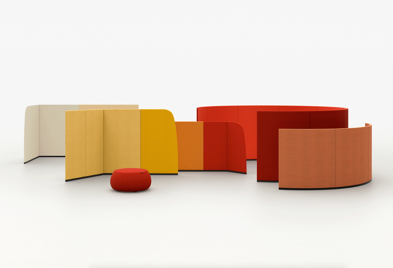
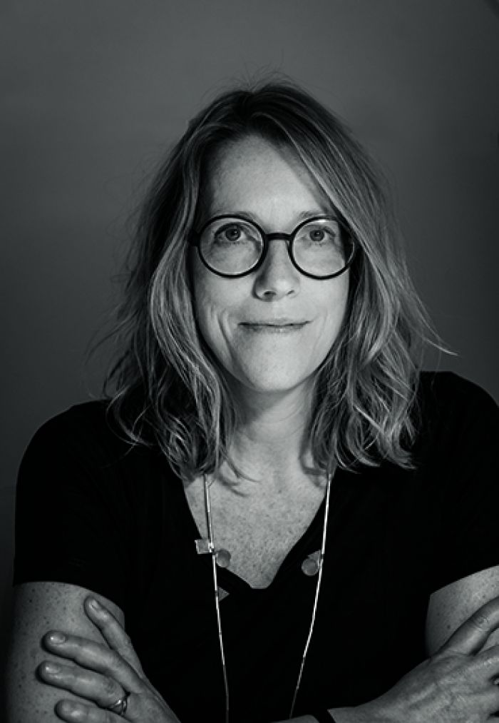
Jeannette Altherr

Jeannette Altherr (1965) is German but has been based in Barcelona since the late 1980s. She studied industrial design in Darmstadt (near Frankfurt) and works as a product designer for Andreu World, Vibia and Tribu. Most eminent is her work as an art director for Italian brand Arper since 2013.

11817183 940080012681999 4224832750109966276 n
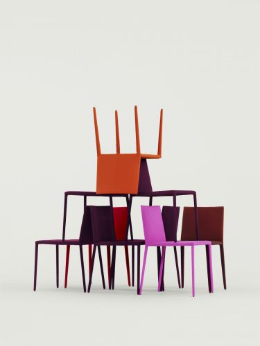
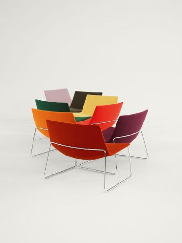
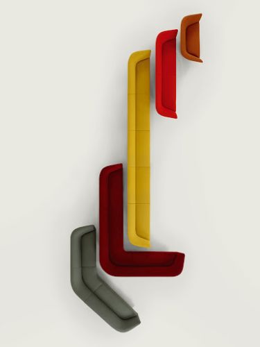
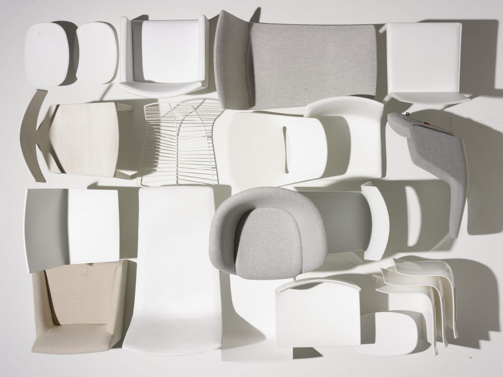
All images Dutch duo Scheltens & Abbenes for Arper
scheltens arper norma staand.1200x0
hRvUVExvDReKRcmCnTKC ihgKCj5rBVExyITNbW1XAkOhUmQ CNb P97jlYd9XWbt80GUfN FlIEjQbd5AfBuRrpGhcVRMl0FNWjRk2SiG1gx8W94MryIu9k9fk9cuXzZXipd3mcz15Ef0T44PW8LlV
6zwdUAVJTvzdB PV6EDLVmplJplGoxPeJIWRZ7s596fSSkFYnLoOJ9 A3x9NSp 3be4Q4wvPlmraajoJpa tBWdtC8QFQ46wBrrjezV6oU7bZow1ES9WSKpeuMh4QvaXib8GfT15rHbvUD76rs5bx7m5


sensuous

As a youngster I went from Germany to Barcelona to finish my studies. At that time, in the late 1980s, Barcelona was very attractive place to be. Life in the city was driven by a newfound identity, a growing pride and self-confidence that you felt everywhere – in the design of the bars, the renewal of the squares and in architecture, in graphic design. This was all multiplied by the preparations for the 1992 Olympics. The contrast between cultures attracted me and was something of a revelation. In general, German culture stresses values like reliability and responsibility. During my education as a designer I learned to analyse and reduce, to find the essence of a thing – a product. But the attitude in Barcelona is more day-to-day and the mentality is light-hearted and sensuous. I learned quite a lot and liked it. So after a year at Massana (School of Design) I decided to stay. Luckily, soon I started collaborating with Alberto Lievore, which evolved into the founding of a new design studio called Lievore Altherr Molina in 1991. From the outset LAM was a multidisciplinary practice: architecture, interior architecture, product design and graphic design. Nowadays we tend to call this a ‘holistic approach’, embracing the mentality, touch and atmosphere of a brand. I think definitions are always somewhat lagging behind the reality of work. .
relationship

The overall art direction always had my deepest interest, but you usually start with a product and the relationship can grow from there. Take Arper, for example. We first met the founders of the brand at the end of the 1990s. Meeting them was a good thing in more than one sense. The market in Barcelona was slowing down a bit and we’d already started to look for possibilities in Italy. In 2003 we started out by designing the first product for Arper, the Catifa, a stackable chair on a sledge. This gradually grew into a whole programme, including a range of different bases, types of upholstery, etcetera. From the product design and development we evolved the collaboration into the creative direction, encompassing the whole look and feel of the Arper brand. More than just furniture, Arper wanted to claim design as a unique selling point. My German background as a designer was helpful for developing that concept.

elegant

Looking back at 25 years of work, most of my designs show a graphic silhouette: clear contours without ornamentation. Curved, sophisticated and elegant, I would say. Possibly feminine. My pallet of preference is for the darker, richer colours, not too bright, yet lively. Subdued and fresh. Never overexcited. The balance between geometric and organic lines has always been present in our work. It’s sculptural, but always restrained.

cornerstone

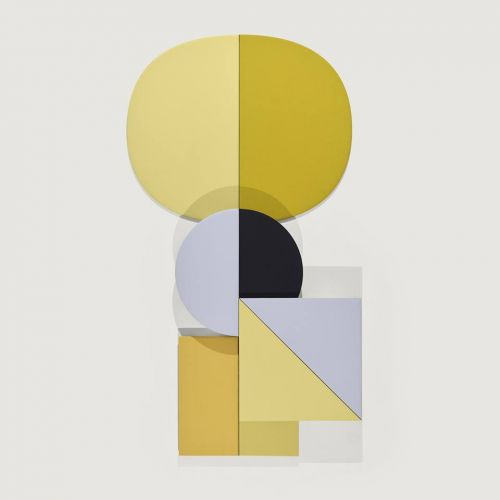
The Arper branding almost feels like an old-fashioned Swiss style, because it’s visually embedded in a corporate identity programme. It’s cornerstone is a Helvetica lettering based on a grid; a well-structured typographic system. This makes the design of stands like at the Salone or Stockholm, but also the website and all graphics, recognizably Arper. The clarity of style makes the brand feel reliable and the message understandable: Arper is about design. I love to work in a way that enables me to develop the concept as a whole. That’s why it’s called holistic. Everything is completely connected; from the individual products to the channels of communication. Last year we were quite over the moon when Arper was awarded ‘Best of Best in the ‘Architecture – Event/ Exhibition’ category of the prominent German Iconic Awards. For the design of the booth I selected Studio Maio from Barcelona. They came up with a simple yet sophisticated concept based on basic geometric shapes: the square and the circle. They were part of layout of the stand as colour panels, but also worked out as a wooden construction. They created a fresh and linear look, but the atmosphere of the stand felt natural and warm, because of the overall use of wood. The booth could represent a home, but might also be understood as a modern office concept, or both. The balance is always delicate.

This interview was published in WOTH issue No9 still available in our shop.