COLOUR AND MATTER, RATHER THAN PRODUCTS
Stefanie van Keijsteren ’s career is a succession of pivoting points. The earliest dates back to her first day at art academy St. Joost in Breda, when she ran into Renée Mennen.
‘I remember exactly what she wore, and she remembers what I wore. We felt an instant spark. And it’s never gone away.’
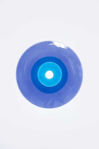
Colour Traces, 2016
‘We just couldn’t stop ourselves’
— Stefanie van Keijsteren
Background
Van Keijsteren and Mennen found they were kindred spirits and had similar backgrounds. Mennen’s parents were both artists and she herself lived in a squatted school building. Van Keijsteren ’s mother not only attended the academy of art but also the academy of dramatic art and, for a couple of years, the academy of music. ‘From childhood, we were taken to openings. I hated that. Like all of those weird friends of my parents. Enter yet another person with no shoes dropping in on us. No, I didn’t want to know that kind of people. I’d have preferred a dull mother, waiting with a cup of tea for me to come home. But in the end, I still went to the academy. So some good came of it after all.’ In Breda, the duo operates like Siamese twins. ‘Fellow students called us Renée and Renée. If one of us was missing, they’d notice immediately. ‘There’s something about you two that works,’ our teachers would say. They proposed that we’d graduate as a duo, the first to do so at St. Joost. Half a day before the graduation ceremony, we realized we needed a name. We decided on ‘R en S’, Renée and Stefanie, in short, Rens. We thought it’d be fun, two girls working together under a boy’s name. Sometimes people call and ask: ‘Can I talk to Rens?’ Then you know it’s come together.’ RENS, in capitals, is now the name of the duo’s design office. ‘But after our graduation, it wasn’t a foregone conclusion that we would continue to work as a duo,’ declares Stefanie van Keijsteren. The move from Breda to Eindhoven was. ‘Our final presentation didn’t draw a single person. We knew we had to move to Eindhoven, that’s where it happens.’ Rotterdam or Amsterdam weren’t options. ‘We’re both very attached to Brabant. I love it here.’
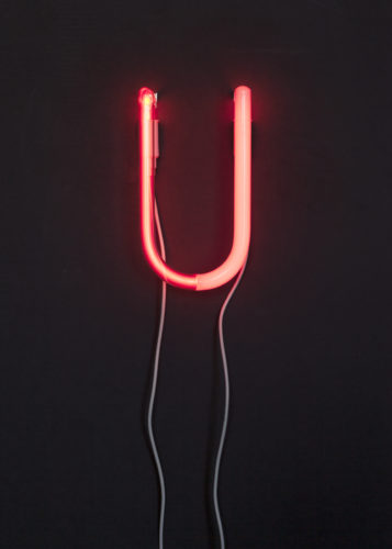
Utube, 2016
Reds
On a shelf in their studio – three half-open floors opposite the complex of Piet Hein Eek – sits a large collection of ceramic cups. Inside the crockery, just peering over the edge, are puppets: the cheerful head of Little Red Riding Hood or a somewhat haughty Judy. It’s RENS’s graduation project, called Kopje Kopje (Head Cup). It earned the pair a lot of publicity and still sells eight years later. Nevertheless, ‘terrible’ is Stefanie van Keijsteren ’s heart-felt response when’s she asked about the early success. ‘We trained as designers and what do designers make? Products! That’s why we tried that. But everything we made after Kopje Kopje ended up in a box somewhere never to come back out again. Product design is not what we’re good at. No furniture maker will ever approach us to design their new chair.’ The duo would rather work with materials and colours. ‘We had this little red car, for example, that was fading quite beautifully in the sun. Most people would call that aging, but we thought how interesting it would be if we could treat the paint with coatings that would create patterns over time.’ The next pivotal point was as radical as it was casual and came in 2012, when Mennen was at home, dying clothes. ‘Old T-shirts suddenly became interesting again. We felt we had to do something with that. We borrowed a huge pan, put it on the fire and threw in everything we could find. We didn’t think: “This is the beginning of our future.” It was just tremendously addictive. We just couldn’t stop ourselves.’ Word of the two girls dying obsessively quickly spread around Eindhoven and reached Margriet Vollenberg of Organization in Design. She dropped in and asked the duo to show their dye experiments in Milan during de Salone del Mobile. That’s where the director of the Zuiderzee Museum saw the presentation and invited RENS to make the exhibition ‘Tot Stof’, about colour in traditional mourning attire. And carpet manufacturer Desso commissioned them to dye its remnants. Today, clients include companies such as Auping and Cor Unum.
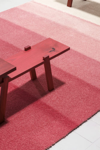
Revive, 2014
End result
Our work method’s a combination of intuition and system. We always start with research, ask ourselves questions and try to visualize things. I’m the thinker. Renee’s usually the one that acts first. She can’t wait to get her hands in the dye. Between us, she’s the messy one.’ Clients did have to get used to the way we work, because initially no-one knows what the end result will be or whether there will be a tangible conclusion at all. That’s why RENS does a lot of autonomous work as well. ‘When there’s no pressure, we simply lay our work aside when we don’t know what step to take next.’ Meanwhile, Stefanie van Keijsteren is facing the next pivoting point: the introduction of Split & Store at the big fair of Milan. ‘It’s a wardrobe and a room divider in one,’ she explains. But more than about function, it’s about a look. Large panels of coloured, matte Plexiglas slide past each other. Depending on sunlight and wardrobe content, this results in a dynamic play of tints and shades. ‘The wardrobe’s actually an excuse to use the material. Nobody in need of a wardrobe would buy this one. But people fall in love with it and want to have it. It’s truly a statement. At the same time, it’s our first serious product.’
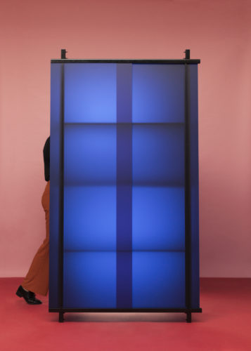
Split & Store, 2016
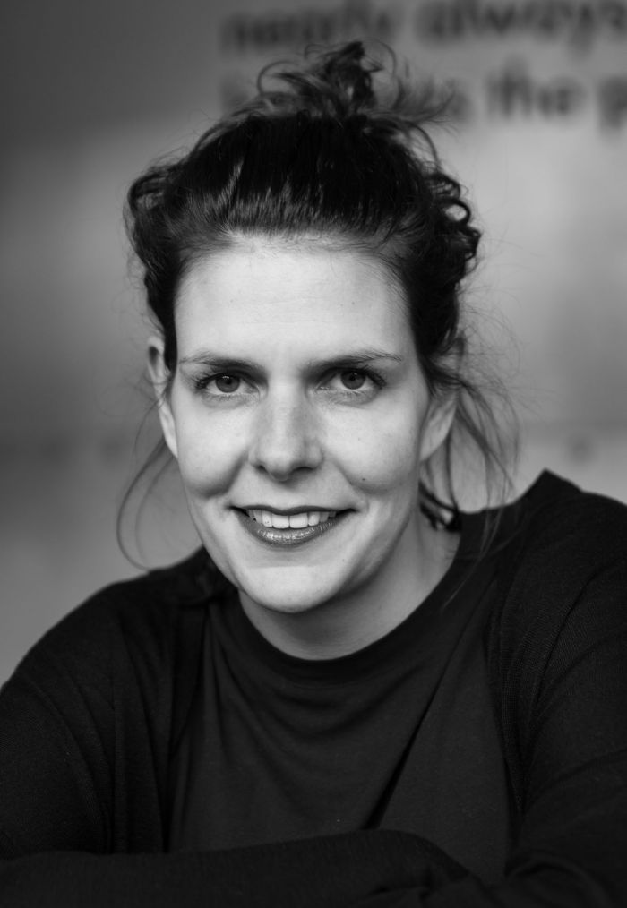
This interview was published in WOTH issue No5 (words by Edo Dijksterhuis, portrait photo by Jan Willem Kaldenbach) still available in english via Bruil & van der Staaij. Or get a subscription here! Dutch versions of WOTH you can order in our shop and an NL subscription is available here.