Wim Crouwel 's Gridnik for Moderna Museet Stockholm
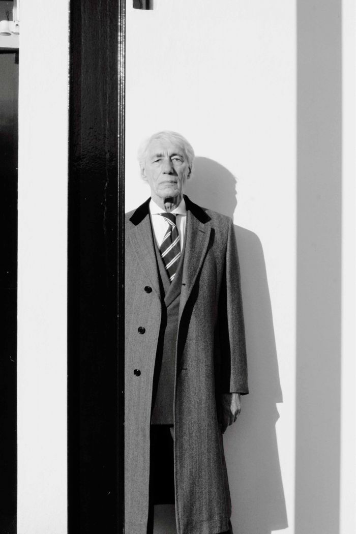
Wim Crouwel (1928) is rightly known as the nestor of Dutch graphic design. Born in the city of Groningen (some three hours by train from Amsterdam in the far north of Holland) he started studying at Minerva Art Academy in the late forties. ‘In the classroom I became fascinated by posters (rather than painting). They were undersigned ‘Cassandre’. But of course I was still completely unaware of his great reputation. Nor could I imagine making posters to be a genuine profession.’ As a youngster Crouwel moved to Amsterdam to join ‘Group Creation’ a collaboration of artistsao.; Wim Strijbos, Hans Ittmann and Armando. Some later started to work on poster and graphic design. One day Wim Crouwel decided to visit Dick Elffers, a leading designer from the inner circle surrounding Willem Sandberg, director of the Stedelijk Museum. ‘The conversation with Elffers altered my perspective decisively’. It sparked one of the most influential careers in modern design.

Wim Crouwel. 'In his own words' book
Ten years later Wim Crouwel was one of the founders of Total Design, the first studio in Holland. Gentleman, functionalist and gifted orator he became professor at the Polytechnic University of Delft. In the eighties Crouwel temporarily stepped back from design practice to become director of Museum Boijmans van Beuningen. In a tv-interview from 1970 Crouwel uttered of the most surprising lines for a designer; ‘my ideal is to be able to call through a design by phone to the printers’. Utopia is never far off and Crouwel had already paved his way into the digital future by designing ‘New Alphabet’ a font based on a grid of lines. In 1967 'I thought it must be possible to start a sensible discussion on how to face the new and revolutionary, electronic developments. The New Alphabet was mostly misunderstood as a face to be read by the machine, like the OCR-B on cheques. It was designed for the sake of discussion’. And so it did. A few years later Crouwel was commissioned to take the experiment a bit further for the design of a new series of ‘number’ post-stamps. Named ‘Gridnik’ he drew with a ordinary pencil asans serifmonoline (all lines are of equal thickness)typeface of which all characters are based on a square grid, with a 45-degree corner. In 2012 Stockholm Design Lab designed a system of unstuffy, airport-style backlit signs applying a special version of Crouwel’s Gridnik typeface, to guide visitors around the building of Moderna Museet in the Swedish capital.
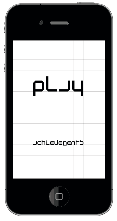
‘New Alphabet’ app by Bram de Leeuw (2013)
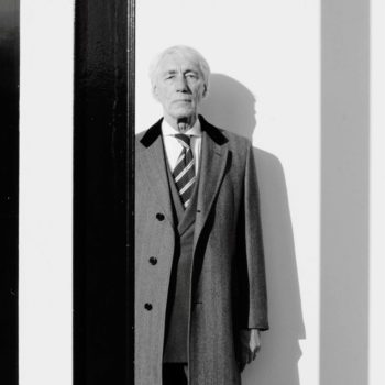
Wim Crouwel 's Gridnik for Moderna Museet was mentioned in WOTH issue No6 (words by Toon Lauwen, portrait from Fantastic Man by Vivianne Sassen (2006) still available in english via Bruil & van der Staaij. Or get a subscription here! Dutch versions of WOTH you can order in our shop and an NL subscription is available here.
