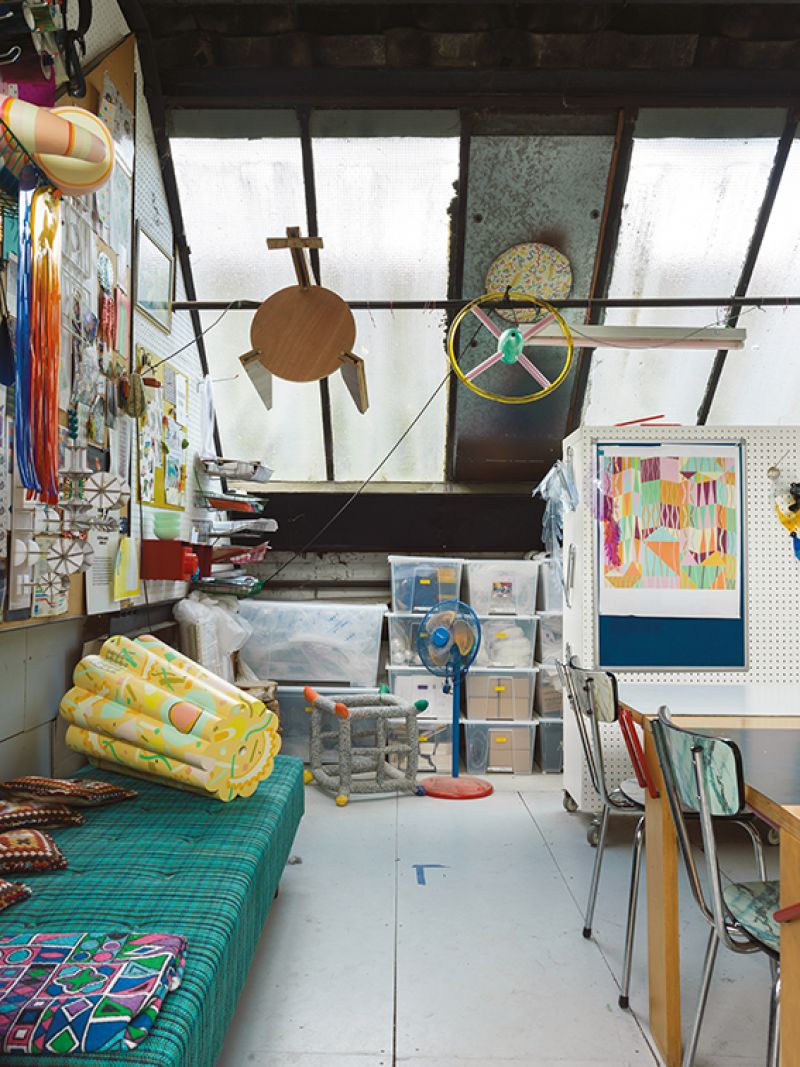
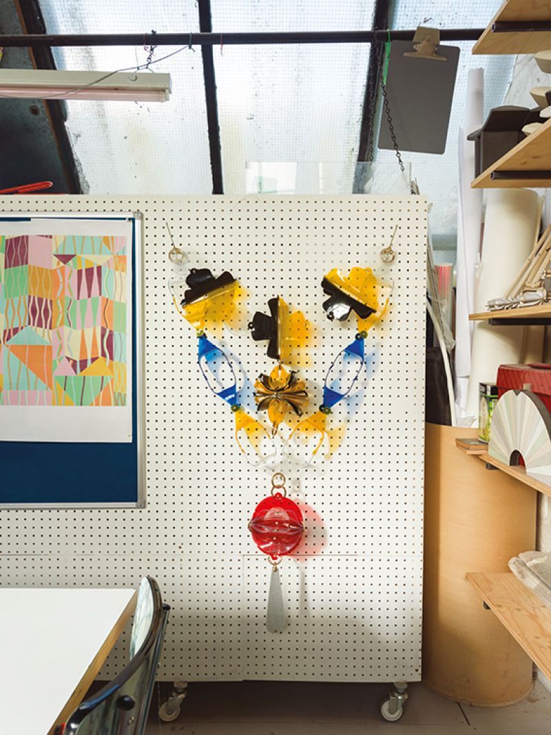
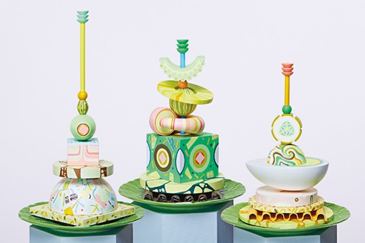
Wood in her Londen studio. Behind her a sample from the Christmas decorations Wood designed for the London restaurant Sketch in 2015. Always interested in experimenting with unusual materials, they are made from PVC butcher’s curtains.
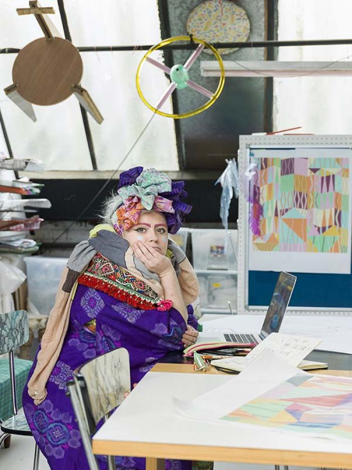
Bethan Laura Wood
‘I have quite an obsession with plastic,’ says Bethan Laura Wood. In the current climate with newspaper headlines – and even the British TV icon David Attenborough – highlighting the amount of waste packaging that’s making its way into the planet’s oceans, this seems like a provocative statement. But then again, Wood is a designer who likes to do things ever-so-slightly differently.
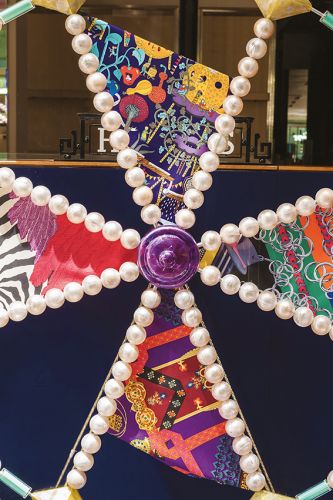
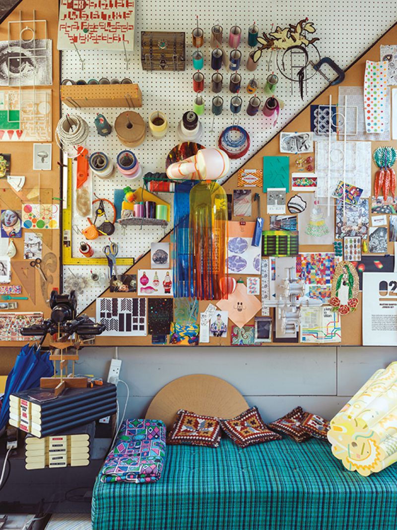
Various views of Bethan’s studio in East London, including samples from her Canape project that launched in 2015’s Milan and was commissioned by US lifestyle brand Tory Burch, as well as a wheel from her beaded motor bike, found objects she uses for reference, a prototype chair, and pieces she used for Hermes Christmas windows.
We’re sitting at one of her Moon Rock tables in her East End flat, part of an extraordinary former electrical warehouse in Art Deco style. The room is filled with pieces from various moments in her still-nascent career. However, the reason we’re discussing plastic is because of the Valextra handbag in front us, for which she has designed some exuberant handles and clasps fashioned from brass inlaid with the same material that high-end spectacles are made of. Realizing how her initial comment is open to misinterpretation, she’s eager to add a dash of nuance: ‘There are good and there are bad plastics, for sure. You have to look at the context and the volume of which certain materials are used and the association you’re putting on that material. When plastics are used for products made to be thrown away, it’s a different association to the beauty that you see in the way plastics have been used, or embraced, in certain areas of furniture and jewellery.’ Quite so.
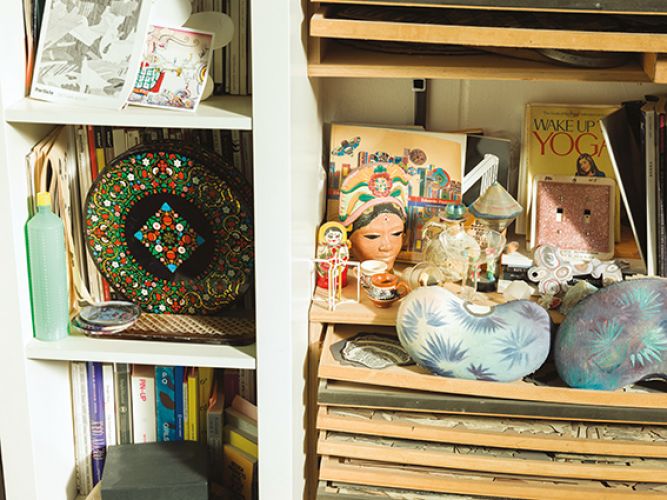
more samples from the artist’s studio. She attributes her interest in colour to various trips to Mexico.
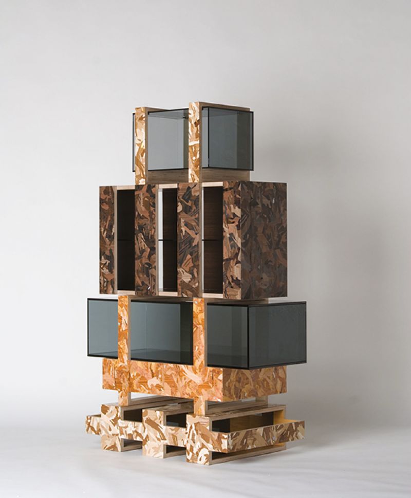
I first met the designer as she was graduating from the Royal College of Art in 2009, where she was taught by Jurgen Bey and Martino Gamper, but had never sat down with her properly. It’s a fascinating experience. Gone is the more public persona of vividly colourful make-up and clothing (as featured in the WOTH photo shoot). Instead, she’s padding around the flat barefoot, chatting away while making coffee. Questions are answered thoughtfully and deliberately, but it isn’t hard to detect that the whole exercise makes her a little nervous – her right leg twitches throughout the interview. It’s all rather endearing. She made her name initially by using a marquetry technique to celebrate and find beauty in materials that are often overlooked, such as standard laminates and particle board, quickly getting picked up by the London Design Museum and Milan’s high-end Nilufar Gallery. ‘A lot of my work and aesthetic is about building up from small elements and combining them together to reach a whole. Marquetry allows me to do that and to mix colour,’ she says. Much has changed in the decade or so since she graduated but, back then, openly espousing the joy of craft techniques wasn’t entirely fashionable. Did she have a sense of where her work would take her? ‘Not really,’ she replies. ‘I was interested in the subject and the end result. The best place for that to sell was in the limited edition, one-off market because it’s about changing that idea of the cost of a material.’
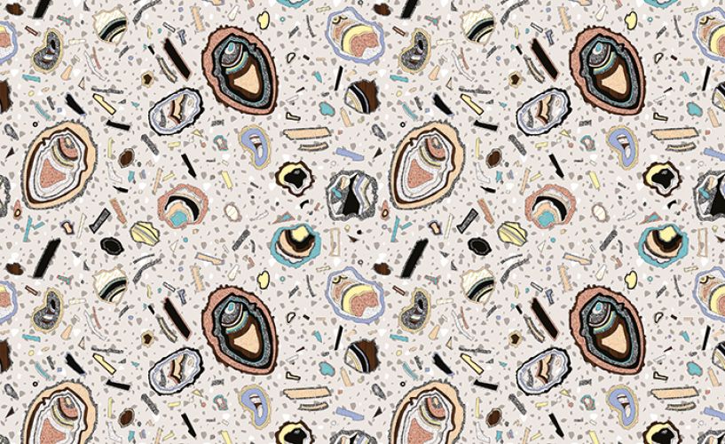
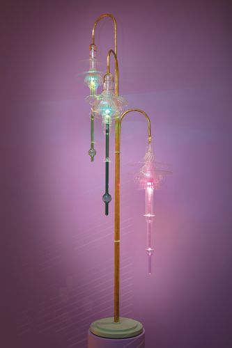
L \ Created in 2009, the Soft Rock repeat pattern was inspired (as the name suggests) by rocks and minerals. It was originally a file used to choose colours for the designer’s Hard Rock furniture R \ A light that featured in Peter Pilotto’s Townhouse Takeover during last year’s London Design Festival.
Subsequently, she worked on a variety of products, for the likes of fabric firm Kvadrat and Bitossi Ceramiche, as well as picking up a fistful of awards, including the Swarovski Emerging Talent Award during the 2016 London Design Festival. The prize for winning the W Hotels Designers of the Future Award in 2013 was a trip to Mexico, which had a profound effect on her work. Although long fascinated by colour, she’d been reticent to use it. As she says: ‘Colour is much more valuable than just being something that’s added on and means nothing. If you change the colour you change so many things because it’s an element that people can relate to very fast.’ In South America, however, she found herself enveloped by bright tones, as she explains, colour was ’on the houses, the floor, the food, everything’. It gave her the confidence to experiment and develop pieces like the Guadalupe Daybed. And it’s this work that forms the basis for an installation she’s doing in the showroom of a major (but at the moment unnamed) Italian furniture manufacturer at this year’s Salone in April.
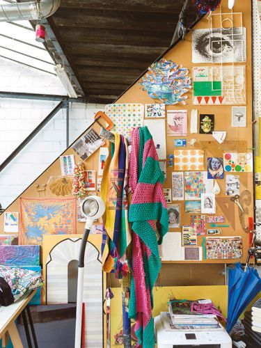
The designer’s studio walls are covered with reference images and ephemera from various projects.
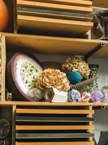
The shelves include a passion fruit from the designer’s project with Hermes.
Other projects to look out for during the world’s greatest design shindig include a new carpet of rather more muted hues for cc-tapis and a refined version of the lights first shown at Peter Pilotto’s Townhouse during the London Design Festival at Nilufar. So there’s a bit on, which always leads to the question of how big she’d like her studio to become? ‘In the last couple of years I’ve been slowly adjusting to being able to work with somebody,’ she laughs. ‘I’m still quite a small practice but I quite like having control of most things. For me it’s important to try and take things slow.’ I fancy the pace of change is only likely to increase in the future.
L \ The Shrine candelabra in the bottom left of the shot was designed in 2012 and inspired by interlocking Japanese construction. R \ The Particle – Stack was designed in 2010 during Wood’s residency at the London Design Museum. She took her inspiration from the museum’s location in Shad Thames, investigating the historical use of the area’s buildings. As a result, the system was built out of crates and packaging materials to reflect the warehouses by the river
This production was published in WOTH No9. This issue is still available in english via Bruil & van der Staaij. Or get a subscription here!
Dutch versions of WOTH can be ordered in our shop and an NL subscription is available here.
